

Rafat Alkhatib
Product Designer with 7 years of experience

Product Designer with 7 years of experience

2024
Design Systems
.
A/B Testing
.
Product Strategy
.
Design Tokens
I led the creation of a responsive design system, ensuring consistency and efficiency across the platform. As part of this effort, I redesigned the insurance plan card, a key component for comparing options. The old design had low engagement and poor discoverability, making decisions harder for users. The new design improved clarity, hierarchy, and accessibility, leading to higher engagement and better conversions while streamlining development.
DESIGN IMPACT
Developed comprehensive documentation to support the design system's adoption.
BUSINESS IMPACT
The new SI design System reduced design and dev. time.
New conversion rate compared to 4.87% with the old card design.

MY ROLE
Design Systems, Design Tokens, Component Builder, Documentation, UI & Interaction Design.

CONTEXT
As part of my role as Design Lead at SimplyInsured.

TEAM
x1 Product Director - x1 Product Manager - x4 Engineers

PLATFORM
Web and Mobile

ASH SAMHOURI
CEO and Founder of Givingloop
Rafat is full of options and very explorative, he offers solutions to problems and is very flexible to discuss UX ideas with, he can see the different perspectives of the stakeholders and therefore come up with ideas that work. I loved working with Rafat and I recommend him for your UX projects.
ASH SAMHOURI
CEO and Founder of Gicingloop
Rafat is full of options and very explorative, he offers solutions to problems and is very flexible to discuss UX ideas with, he can see the different perspectives of the stakeholders and therefore come up with ideas that work. I loved working with Rafat and I recommend him for your UX projects.
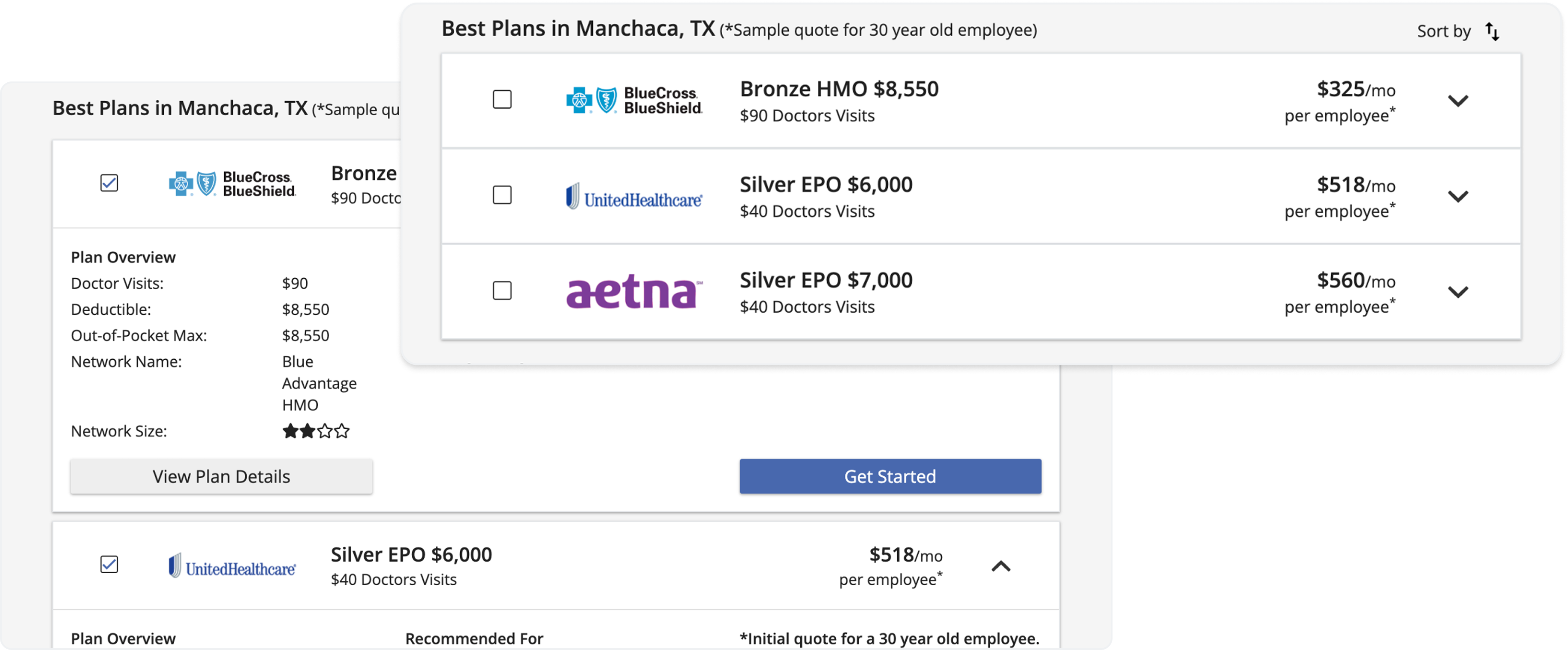
PROBLEM
The absence of standardized components slowed development and caused poor information hierarchy on the card, leading to decision fatigue and increased drop-offs.
GOALS
PROCESS
Document and track compoenet building process in Excel.


MAIN STYLING
Starting with the basics.

COLORS

MAJOR DESIGN DECISIONS
Given the upcoming changes, I designed each element with multiple variations to ensure flexibility in usage.


ACCESSIBILITY
IMPLEMENTATION
I started with our major redesign, the insurance card redesign.
Problem
Only 4% of total users signed up through the old card.
Goals
Ideation
Deciding on the main design and placement of the AI agent. We know the agent should live in the employer dashboard, but where and how to introduce it?

Pros ✅
- Positioned above the fold for maximum visibility and quick access.
- Chat interface is collapsible, giving users control over their experience without disrupting workflow.
- The AI Agent is prominently featured, encouraging immediate interaction.
Cons ❌
- The upgrade button lacks visibility, making it hard for users to discover when and how to upgrade.
- There's no dedicated space to showcase plan benefits or highlight the value of additional tools

Pros ✅
- Clearly introduces SimplyInsured’s marketing message, reinforcing brand value.
- Provides screen space to display default prompts, improving discoverability and engagement.
- Chat can be minimized to a compact widget in the bottom-right corner, maintaining a clean interface without losing access.
- Users can notice other tools and see what SI has to offer beside the Ai Agent.
Cons ❌
- Displaying the chat in an overlay above the main interface can distract users and pull focus away from the tools already on screen.
- When minimized, the chat widget overlaps with the Help section, creating potential confusion or accessibility issues.

Pros ✅
- Compact layout takes up minimal space, keeping the interface clean and focused.
- Sets clear expectations for users by presenting the chat in a familiar, contained format.
- Upgrade button is clearly visible, making the next step obvious.
- Positioned above the fold for immediate visibility and access.
- Default prompts are easy to see, guiding users to engage with the assistant quickly.
Cons ❌
- Users aren’t made aware of all available SimplyInsured plan tiers, including the free version—limiting transparency and comparison at a glance.

Smart Personalization via Employee Selection
To deliver plan-specific answers, we introduced a dropdown to select an employee.


Smart Personalization via Employee Selection - The flow
Once an employee is selected.
- All answers were dynamically customized to that employee’s insurance plan
- A visual callout appeared in the chat header confirming the selection
- The chat icon subtly changed to reflect the employee context
- Users could clear selection anytime to return to general Q&A
This allowed us to support multiple use cases—answering for a specific employee or exploring general benefit details.

Ideation
I explored multiple concepts, carefully weighing the pros and cons of each before deciding on the final direction.

Pros ✅
- Saves vertical space, allowing more cards to be visible at once without scrolling.
- Displays key information at a glance, helping users quickly scan options.
Cons ❌
- Feels overly dense and visually crowded.
- Expansion behavior is unintuitive, leading to a clunky experience.
- Adds cognitive load, making it harder for users to process information easily.

Pros ✅
- Saves vertical space, allowing more cards to be visible at once without scrolling
- Cleaner card with more room to breathe
Cons ❌
- Lacks immediate access to key actions like “Get Started” and “View Plan Details”
- Requires additional clicks to access important information
- May reduce user momentum and increase drop-off in the flow

Pros ✅
- Add rating for the insurance carrier which helps in making decisions
- Displays key information at a glance, helping users quickly scan options
Cons ❌
- Some information may appear repetitive or redundant
- Slight increase in vertical spacing, reducing the number of visible cards above the fold
Solution
By combining the strengths of each concept, balancing priorities through red route analysis, and aligning with user expectations, we selected a fourth concept as the final direction.


Allow expansion so the user can read more details that are important for making choices.

Card highlights appear on hover, and if the user is interested, clicking expands the top section accordingly. The new favorite feature was placed neatly on the right corner.

The highlight area and favorite feature disappear only when the user clicks 'Compare'—a deliberate decision to direct focus toward the comparison action. To reinforce this, the top section is styled with a distinct color, and a bottom sticky nav appears, with the same color, showing the compared plans.
Results
- Immediate Conversion Rate: The new card design achieved a 6.19% conversion rate, up from 4.87% with the previous design.
- User Flow Engagement: The new design showed higher completion rates at key steps like 'Viewed Company Application' and 'Application Signed,' reflecting a smoother and more effective user experience.

Other re designed features
Tables are a core element of our product, appearing across the platform in various sizes, formats, and with different actions. This made it essential to account for them carefully within the design system.


Other re designed features
The FAQ section was redesigned and tested through A/B/C testing. The design system played a vital role in guiding decisions for the new component. Full project details are shared in a separate case study.


You may check a more detailed case study version of this project
Here